


“The Times (New Roman) are a-Changin,” read the subject line.
Blinken’s cable said the shift to Calibri will make it easier for people with disabilities who use certain assistive technologies, such as screen readers, to read department communication. The change was recommended by the secretary’s office of diversity and inclusion, but the decision has already ruffled feathers among aesthetic-conscious employees who have been typing in Times New Roman for years in cables and memos from far-flung embassies and consulates around the world.
“A colleague of mine called it sacrilege,” said a Foreign Service officer in Asia, who like others spoke on the condition of anonymity to discuss internal policy changes. “I don’t mind the decision because I hate serifs, but I don’t love Calibri.”
At institutions like the Pentagon, the bureaucratic currency is fighter jets, tanks and missiles. But at the State Department, words are the coin of the realm, and how they are used matters.
“I’m anticipating an internal revolt,” said a second Foreign Service officer.
Another said the water-cooler talk ranged from strong approval to mild grumbling. “It definitely took up, like, half the day,” said the official.
The department has used Times New Roman as its standard typeface for memos sent to the secretary since 2004.
In recent years, the decorative “wings” and “feet” of serif fonts have gone out of fashion in design circles and consumer brands have opted for cleaner sans-serif fonts in their logos such as Helvetica. “Millennials Have Killed the Serif,” hailed a New York magazine headline in 2018.
The Washington Post uses the serif-friendly typeface Miller Daily in print and Georgia in digital versions.
The secretary’s decision was motivated by accessibility issues and not aesthetics, said a senior State Department official familiar with the change. It is the latest big copy edit shake-up under Blinken in just a few weeks. Earlier this month, the State Department announced it would start spelling Turkey as “Türkiye” in diplomatic and formal settings at the request of the Turkish embassy.
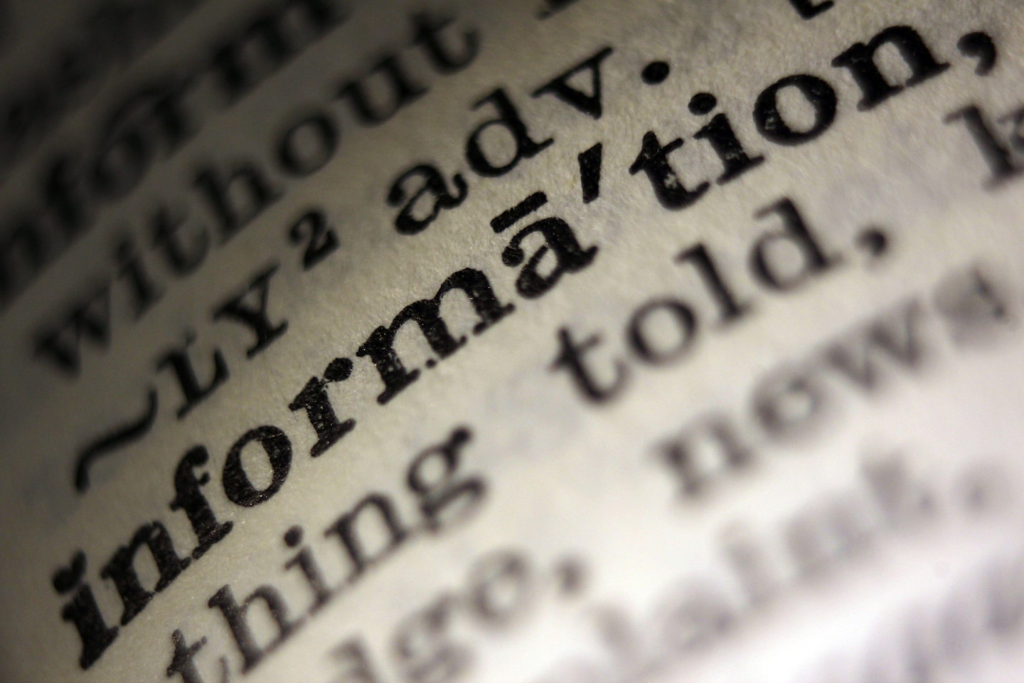
Many experts agree that serif typefaces — categories of fonts with added strokes — are more difficult to read on computer screens. (The difference is lessened when it comes to printed materials.)
Size is important too: The best practice, according to the University of Edinburgh’s Disability and Inclusive Learning Service, is to use 14-point font and avoid writing in block letters or italicizing or underlining text. “Good practice would be the use of a sans serif font,” the service said in an accessibility guide. “Fonts such as Times New Roman are much less accessible.”
But there is no one-size-fits-all accessibility solution, says Jack Llewellyn, a London-based designer who specializes in typography, and a change in font that could help some readers may actually make reading more difficult for others.
In its cable, the State Department said it was choosing to shift to 14-point Calibri font because serif fonts like Times New Roman “can introduce accessibility issues for individuals with disabilities who use Optical Character Recognition technology or screen readers. It can also cause visual recognition issues for individuals…
Read More: State Department to phase out Times New Roman font, adopt Calibri


